Ever struggled to get the image-to-text ratio just right in your PowerPoint slides? Don't worry, we've all been there. In this post we cover a few tips from the experts on how to get the most out of both our messages and our images, making our presentations more memorable and relevant.
We've put together 5 quick steps to help you create clearer and more compelling presentations.
1. Start with paper, not PowerPoint

Most people always start with their slides first, searching for the nicest looking presentation on their hard drive, clicking Save As, and tweaking away. They start switching headlines, moving bullets around and swapping copy without even considering that fact that the content was originally created for.
Why do we do this? Probably because using a slick-looking presentation that we know has "worked" in the past feels faster and simpler.
So, what's the problem? It allows the slides to take the lead, not the message. Additionally, all the tweaking will often end up taking more time than starting from scratch.
Every presentation is unique, and while there's certainly a place for PowerPoint templates, it's always good to figure out what you want to say before you move on to how you're going to say it.
So, start with a blank piece of paper.
Or a whiteboard. Or perhaps some mind-mapping software. Just don't start with your slides.
Here's a few questions you should always try to ask yourself at this stage:- Why am I delivering this presentation in the first place?
- What's my core message? The one thing people can't forget.
- What other points do I need to get across?
- What do I want people to do with what I've said? Action points?
2. Identify your headlines
These should be one-liners. Not the cheesy kind, just something short and sweet. Two-liners are ok too, but any longer and you're probably going to start sending your audience to la-la land.
3. Lose everything else (if at all possible)
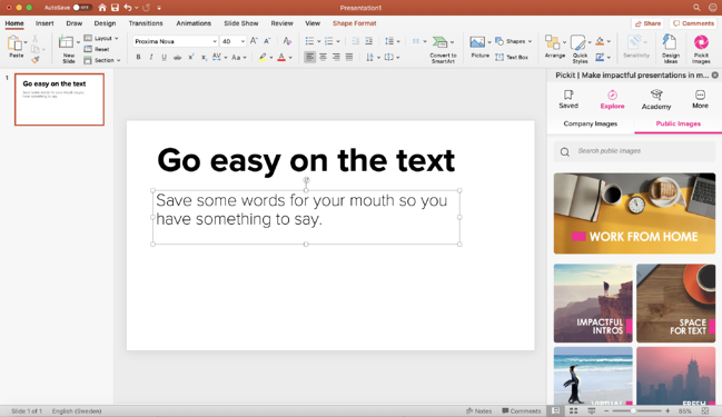
Now, try losing everything but the headlines. Saving the rest for your talk means you have something to say. If everything's on the screen, your audience may as well read your presentation instead, in which case we suggest you send a world-class Word doc instead of giving a presentation.
And if you do need to add a large chunk of text to your slides, remember to pause and let people read it for themselves, especially when presenting online. Otherwise you're making them choose between paying attention to you or to your presentation. That's not a decision you want to force them to make.
You can also try breaking it up into smaller chunks and adding some speech bubbles, shapes, or clipart to help make it all easier to digest.
Oh, and try killing as many bullets as possible before they kill your presentation. When it comes to bullets, less is more.
Don't have Pickit? Get a quick 15-minute demo from one of our product specialists.

4. Choose your images
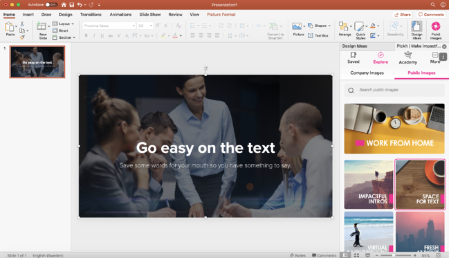
As much as we love a vibrant, action-packed picture, sometimes an effective PowerPoint presentation calls for something a little subtler. We recommend you choose presentation images that don't get in the way of your message.
Another option is to use a layout suggested by PowerPoint Designer, like the one you're seeing above. If your image is too detailed and the text is hard to read, they'll often add a filter to make the copy legible. Just remember, busy backgrounds can compete with your copy, so if in doubt, keep it clean!
At Pickit, we have a whole collection called Space for Text, curated by our team of editors, who are constantly handpicking images and creating themed collections perfect for PowerPoint. Rather than sifting through endless images, Pickit gives you access to relevant content, such as PowerPoint backgrounds, themed icons and modern clipart.

Read more: 7 best practices for effective remote presentations
5. Revisit your slides, one at a time
Don't just skim through them. Revisiting each slide with fresh eyes is key. Presentations have a tendency to evolve and take on a life of their own, and you need to make sure your slides all work well together in perfect synergy and that your message continues to makes sense.
Don't be afraid to let your images convey your message, but make sure that your message always plays the starring role.
These are just 5 ways you and your colleagues can improve the quality of your presentations.
Since sharing is caring, why not pass on our tips to your team? Hopefully it'll help increase both their productivity and clarity too, doing both them and your organization a favor, not to mention the audience.
Don't have Pickit? Get a quick 15-minute demo from one of our product specialists.

Who wrote this?
This was posted by Brad Hawkes, our Director of Marketing here at Pickit. He's not a professor of rhetoric and he's never given a TED Talk. He has, however, clocked up over 1000 presentations, seminars and talks over the last 15 years, picking up a few ideas along the way. He once spoke to a crowd of 5000, but mostly he's spoken to crowds of 5, and he's always looking for simpler, clearer ways to say things and get a message across. He also makes a fine cup of coffee.