7 best practices for effective remote presentations
Whether you feel like a presentation pro or you get the shakes when it’s your turn to step up for a monthly report, delivering a deck remotely is often a different animal altogether to live presenting. No more relying on stage presence, charisma, persuasive body language or your ability to work a room. And if you're more of a butterflies-on-steroids presenter, you probably think this is your ticket out; “Finally, I don’t need to bother with all that empty rhetoric stuff and can get straight to business.”
Not so fast!
Delivering a presentation remotely doesn’t mean you’re off the hook when it comes to being engaging. It might even mean you need to lean in and make an even bigger effort to keep people engaged. Remember, they are staring at a screen full of endless entertainment options and distractions, and if your webcams are all off–they shouldn’t be, but that’s another post–then you can’t even see what they’re doing. At least when you’re in the same room, there are still some social codes can help people refrain from zooming out too much (poor pun intended), even if I’m fully aware some audience members still sit and stare at their phones or fiddle with their laptops in live settings too.
So, how do you get your message across in the best possible way online? What are some ways you can help people stay engaged and what are the main differences between speaking on stage, at the office, and from your kitchen table? And how can you turn your bedroom into a board room at the click of a button? We’re glad you asked.
Here are 7 best practices for better remote presentations:
1. Blur your background

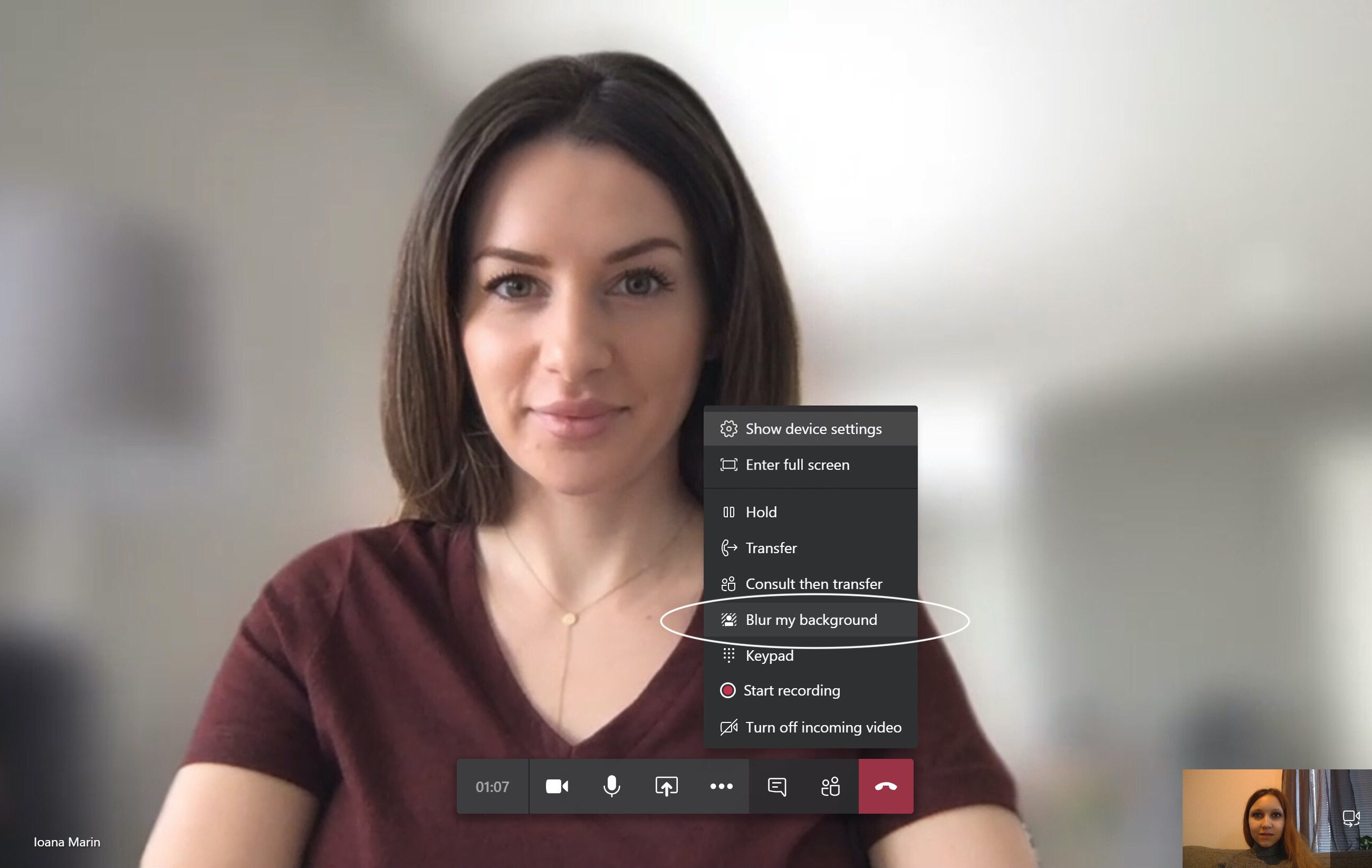
If you’re working from home, you might not have the luxury of being able to choose your setting every time you’re going to jump on a video call. Whether you’re competing for space with homeschooled kids, or you just didn’t have time for the housework this week, blurring your background can mask even the messiest home and help make you look like a pro.
A clean backdrop is a great way to avoid distractions and help people focus on what’s most important: YOU. (Ok, your content is probably even more important, but you know what I mean.) Luckily, you don’t need a studio style designer home with perfectly plain walls to sit in front of, Teams has you covered. Just click the ellipses and choose Blur my background. Voila!
2. Get everyone else on camera too
Even if you’re sharing your screen and your audience members are reduced to a grid of tiny heads in the corner, getting them on camera helps. It gives you at least some sense of how they’re reacting to your message, but it also helps hold them accountable.
Now you can spy on them and look for those distracted movements like eyes looking down at a phone or scanning from side to side revealing they’re actually catching up on their favorite blog (probably this one). Ok, that spying part made me sound like a stalker, but even if you're not in the same physical space, being able to see one another, make eye contact and get a sense of how others are engaging with the topic is incredibly helpful, and a pretty normal non-creepy part of most human interactions.
3. Make it interactive, even if you're sharing a PowerPoint
Just because you’re presenting, that doesn’t mean you need to present all the time. Now that you’ve got less of that in person, live mojo to feed off, you’ll need another strategy. Instead of working the room, you can now work with all the rooms represented on the call, webinar or whatever it may be.
Ask questions, request feedback, or why not enlist a couple of helpers ahead of time to deliver segments for you. The different voices (and perhaps faces, sorry!) will be a welcome change and make the presentation feel more dynamic and engaging.
4. Avoid long monologues and... pause

When you’re pacing the room at the office and interacting with your colleagues, it’s easier to go all Martin Luther King Jr. and get carried away from time to time. You’re in control of the setting, the delivery and much of how your little speech is received. If you’re a good, engaging speaker, you might be able to keep your audience captive longer, but when you’re stuck with nothing but a webcam and a mic, you might just want to pause more often and check in with the audience. Chances are there’s at least a slight delay, the audio might not be the best, and someone’s internet might have dropped out. Pausing gives everyone the chance to catch up, digest and ask any questions. See point 5.
5. Add a little more text to your slides
Normally, we’re huge advocates of keeping it short and sweet when it comes to text on slides. Nothing’s worse than making people listen to you and read long lines of information at the same time. However, now that you don’t have the same ability to use body language, props, and other cues to embellish your message, it can be helpful to add a little more text and do a little less talking. See point 4.
6. Use decent equipment
This might seem obvious, but making sure your camera’s working ok and the old AirPods are charged is key. You want the best possible audio and video experience possible now that you’re relying even more on your voice (and face) and less on other body language.
7. Try switching up the design, and use more images

When it’s a live talk, speech, lesson, pitch or report, you can use your body language, movement, tone and other cues to help keep the audience engaged. That means you might get away with keeping the slides a little plainer and to the point (ok, plain is never ideal, but you get the idea).
Now, the slides are pretty much all you’ve got! Instead of following the same format on every slide and relying on your masterful movement and electrifying presence to keep things interesting, you now need to add that variation and element of surprise to your slides.
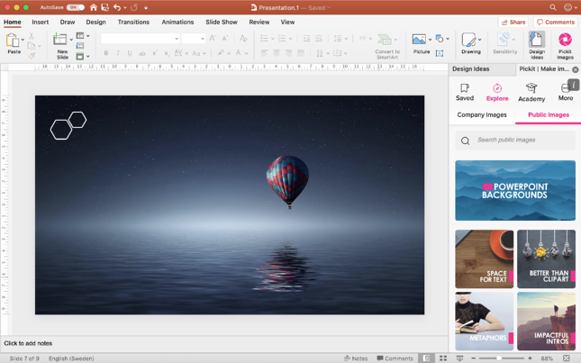
Think about how magazine layouts are made to keep you flipping the page. They make use of different layouts, designs, and interesting images on every spread, changing it up from one article to the next. Try using Pickit images and PowerPoint Design Ideas to help you add a little variation and create something engaging (all within your company’s brand guidelines, of course!).
There you go, 7 ways to enhance your online presentations and better engage with a remote audience. Want more tips and tricks on how to create effective PowerPoints that work in an online setting?
Book in for our weekly webinar 3 steps to impactful presentations.

