And say hello to the all-new Pickit. The smartest, simplest DAM platform on the planet.
The pink icon
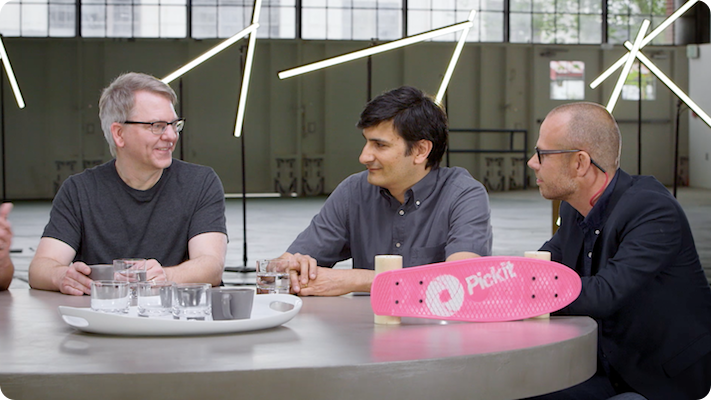
You may have first seen the symbol on a big screen at Microsoft Inspire, an episode of DECODED, or in a photo of CEO Satya Nadella holding the unashamedly pink Pickit skateboard with the familiar round circle spraypainted on top.
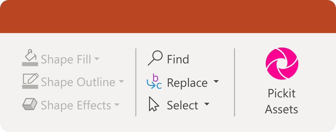
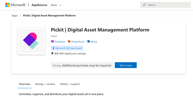
Most likely, you've just seen the icon in the top right corner of your PowerPoint menu with the words Pickit Images underneath. It's the logo belonging to the #1 Office app worldwide, constantly situated at the top of the listings on AppSource and the Office Store.
And now we're throwing all that recognition away and sending it off to retirement.
But why?!
It's a fair question. Savvy marketers know that any brand recognition is good recognition – often hard earned and not to be wasted. When people associate a symbol with a situation or service, that's valuable real estate in their minds. Getting them to think of Company X next time they need Service Y is what brand people spend their lives dreaming about and drooling over.
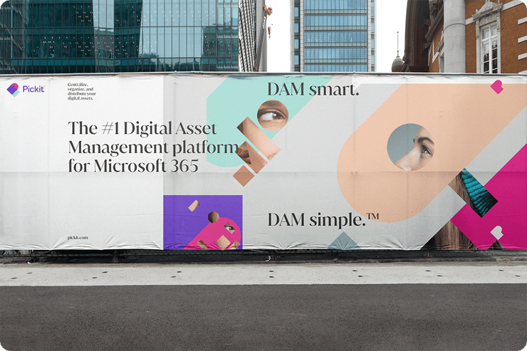
In our case, over four million installers all over the globe have at some point seen the pink Pickit icon as synonymous with Legally Cleared™ images and impactful PowerPoint presentations – and more recently Google Slides. That's still true; for the record, our Pickit Stock™ library of over a million licensed images and our #1 PowerPoint add-in aren't going anywhere anytime soon. But, we've come along way since our early days as a photographer community democratizing the way people access and use presentation images, and we're become more than an Office add-in.
The evolution of Pickit
Over the last year or two, our eager developers have been busier than ever, building countless modules, features, and new functionality at a record-breaking release rate.
So far, our story has three main acts:
- Pickit the photographer community
- Pickit presentation image provider
- Pickit the DAM platform
That round camera lens symbol was synonymous with our photographer community, and it worked for Pickit the presentation image provider. But we felt Pickit the DAM platform called for something fresh that reflects what's under the hood, and does justice to our evolution – to us becoming a modern, intuitive, and robust Enterprise DAM platform.
The brief
Like with any rebrand, we knew it was important to do it right when we updated our visual identity. We turned to award-winning Swedish designer Mattias Brodén of Entire Studios, who is ultimately the brains behind the new brand. Alongside a solid selection of vinyl records and designer chairs, Mattias has a substantial collection of rebrands to his name – with a portfolio including everything from craft beer cans and skin care products to plant-based tuna murals (yep!) and iPhone apps, we knew we were in for a good time.
Here's what we ordered for phase one:
- New logo
- Set of symbols
- Brand colors
- Typography
And here are a few of our requests:
- Try to reference the round symbol somewhere
- Keep some pink, it's how most people recognize us
- Keep our mission, vision, and personality top of mind
- Create a set of flexible symbols that illustrate common pains and gains
The logo
We wanted to leave some sort of nod to a round pink circle in there (well, half a circle at least) as a tribute to our beginnings and a reminder that we still provide licensed presentation images, but we also wanted something we could build on. Something that encapsulated all the new features, solutions, and problems we solve.
Enter our new logo.
The symbols
While there's definitely a case for seeing a leaning "P" or even a heart turned on its side, the new logo is actually made up of several symbols that are all based on the problems our customers face, and the solutions we provide them with.
Let me show you.
Pains
First up, we've got scattered assets spread across cloud storage systems and lying around on hard drives. There are different shapes, sizes, weights, and file types, and nobody knows where to find them. The goal was to sum up the primary problems our users have before switching to Pickit:
- Disorganized assets
- Decentralized storage
- Distribution issues
Gains
Then we wanted to illustrate some of the primary gains or solutions users can expect when they use Pickit.
- Organized assets
- Centralized storage
- Optimized performance
- Simplified distribution
After playing with a few different sets of symbols representing everything from assets and boxes to performance charts and graphs, here's the primary set we settled on.
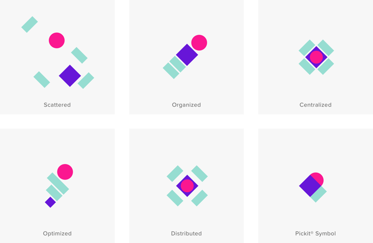
And here's how they lend themselves to motion and illustrating the way Pickit can simplify the way people manage, store, and share their digital assets and turn their problems into solutions.
To see more of our new visual identity in the wild, visit our pickit.com, or why not explore our new Platform and Solutions pages? For a look at the platform itself, schedule a demo with one of our product specialists.