37 years after it's invention, Microsoft Word is still the go-to for most text-based documentation in the majority of businesses and organizations. This year alone, billions of Word docs will be written and circulated by ordinary (no offense!) office workers like you and me. That said, despite decades of practice and an increasingly image-savvy user base–thanks smartphones!–so many of us still struggle to put together a killer doc that harnesses the right visuals, fonts and design practices to enhance our work and help get our message across.
In this post, we'll walk you through some common mistakes to avoid and a few simple ways you can turn your newsletters, meeting notes, memos and more into something people really understand and remember–and want to read in the first place.
Here goes...
Mistake #1: Using too many fonts

So you think you've created a compelling document and you're ready to hit the send button. Before you do, please pause for a second and ask yourself:
Is it easy to read and understand?
It's surprisingly common to overlook such a key design decision as which typeface to use.
Traditional knowledge says that serif fonts are easier to read in printed documents while sans-serif fonts are better on the eyes when read on a digital screen. But perhaps even more importantly, using multiple fonts and mixing and matching without intentionality makes our documents look messy and uninviting.
So, whether you choose Arial, Palatino or Helvetica, stick to the same typeface throughout the document and only use a different one for headings, subtitles or specific kinds of text. If you really need to.
Mistake #2: Using too many colors

We love a splash of color, but unless you're working at a preschool or an art studio, you might want to go easy on the palette and stick to a selected few hues–preferably those chosen by your Brand and Marketing teams.
Tip: if you're trying to use colors to differentiate between different categories, chapters or sections, try using different shades of the same color to keep it coherent without losing the ability to add some variation.
Mistake #3: Using low-res images
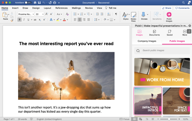
There’s a reason why people make fun of pixel art (hint: it’s not because it’s easy on the eye). Few things are worse in the world of Word than a low-resolution image blown up to a pixelated mass that's unintentionally sending Mario Bros. vibes. Please, for the sake of your colleague’s eyesight and your professional dignity, use better quality images. Thankfully, there's no excuse anymore for not using top quality content. You know where to find us.
Mistake #4: Using unlicensed photos
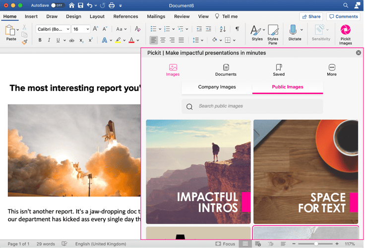
Just, you know, illegal. And kinda stingy. I mean, you want to give those hard-working photographers and artists the credit and compensation they deserve, right? Luckily, Pickit works directly with a vast community of photographers and image providers, so you can be sure that all of our images are both paid for and ready for picking.
Mistake #5: Using cheesy clipart images

Small squiggly stick figures can be cool and all, but the world has moved on. As our screens and lenses have improved, so has our taste–our eyes just aren't accustomed to the kind of content that used to pride the covers of our school bulletins and weekly newsletters at work.
That doesn't mean we should all abandon icons and illustrations, just that we need to be mindful of what kind of content we're turning to. Pickit’s library includes multiple sets of icons to help you get your point across, without freaking anyone out.
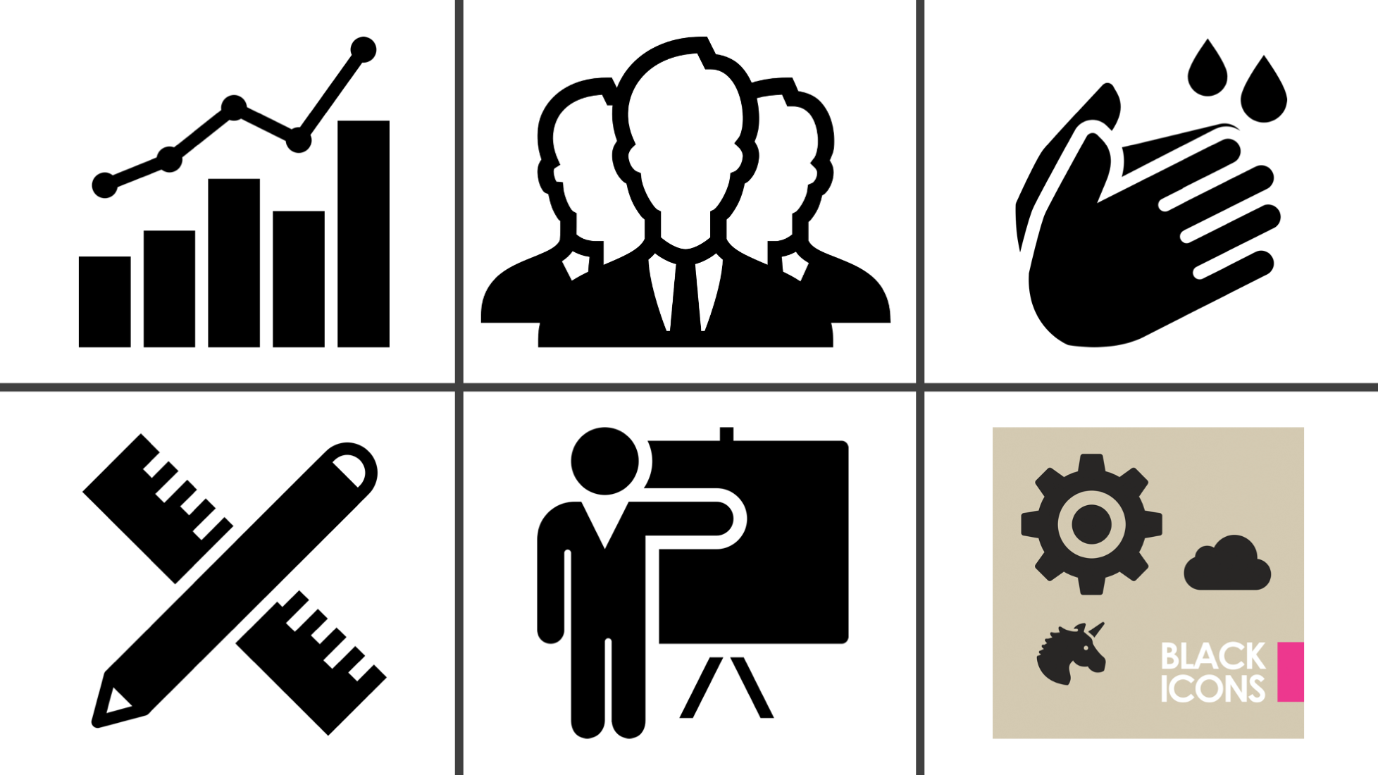
Here are a few collections to start with, all found in our Office add-in:
- Better Than Clipart
- Eco Illustrations
- Black Icons
- Popular Illustrations
- Icons by Timén
- Business Illustrations
- Clipart Characters
Mistake #6: Not using enough white space

The reasons you've chosen a Word documents and not a PowerPoint presentation is probably that you have a lot of important information to convey, but remember to use a generous amount of white space to strike a healthy balance. Some people make the mistake of thinking more is more, and that cramming every corner of a document full of content makes it look more robust or professional, when in fact, leaving some space around your most important messages actually enhances them and makes them easier to digest and remember.
Take time to revise any wordy sentences or paragraphs and keep it simple. Sometimes less is more. Why not add a line break or two and create some space for your text to breathe?
Mistake #7: Misunderstanding proximity
Proximity relates to the placement of elements in relation to each other. For example, the closer a heading is to the paragraph below, the more it communicates to the reader that the heading and paragraph directly relate to each other. A good use of proximity also makes the reading experience more pleasurable, so keep related elements closer and unrelated elements further apart.
By avoiding these mistakes and taking on a few of the tips, I hope you'll find you can take your docs up a notch or two and better engage with your coworkers in a more inspiring way. Let's face it, if you're going to create the doc in the first place, you might as well make the most of it and make your work stand out.
Use Pickit to help you do all of the above and level up your Word documents today. Install the award-winning Pickit add-in and get unlimited access to licensed photos, icons, clipart and your company’s images in Office.
Don't have Pickit? Get a quick 15-minute demo from one of our product specialists.